5.1 Running the Built-in Efficiency Testplan
The first test uses the Load Component Values tool to prepare the schematic for Multi-Step by parameterizing the DVM Source and Load. It will also run Multi-Step and create aliased efficiency vs. load vectors: one for each of the selected input voltages. The second test does not execute a simulation; instead, this test uses the Load Component Values tool to reset the schematic to its original state, creates X-Y scalar curves of the aliased efficiecy vs. load vectors, and then promotes the new curves to the DVM test report's overview page.
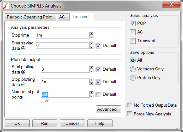
Before running the Efficiency Testplan, it is important to understand that all component loss measurements are calculated based on the simulated time domain waveforms appropriate for each power stage device. To obtain accurate loss measurements, it is essential that each critical voltage and current be represented by an adequate number of data points so as to capture each switching transition with sufficient resolution. The number of data points defaults to 10k; however, to run the efficiency testplan, you need to increase the number of plot points.
To change the number of plot points before you run the efficiency testplan, follow these steps:
- From the menu bar, select .
- Click on the Transient tab.
- In the Number of plot points entry, change the value to 50k as shown
below:
To run the entire efficiency testplan, follow these steps:
- From the menu bar, select . Result: A pop-up hint provides information about the numerical calculation methods used to calculate the efficiency.
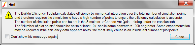
- Click Close to dismiss the hint window. Result: The Configure Efficiency Testplan dialog appears:

- This dialog will allow you to set the desired source voltages and load steps. The
nominal, minimum, and maximum input voltage values are taken directly from the DVM
control symbol. It will also allow you to increase the number of cores used to run the
mulit-step simulation. Increase the number of cores to the maximum allowed on your
system. Click Ok when finished.Result: The Save As dialog appears:

- Save the tesplan using the default setting by clicking Save.Result: The testplan has now been created and the test selection dialog appears:
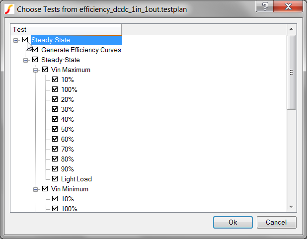
- To run all tests in the testplan, check the Efficiency checkbox.
- Click Ok. Result: DVM runs the entire efficiency testplan for all three input voltages and for load currents from 10% Load to 100%; then an overview test report opens with a summary of the results.
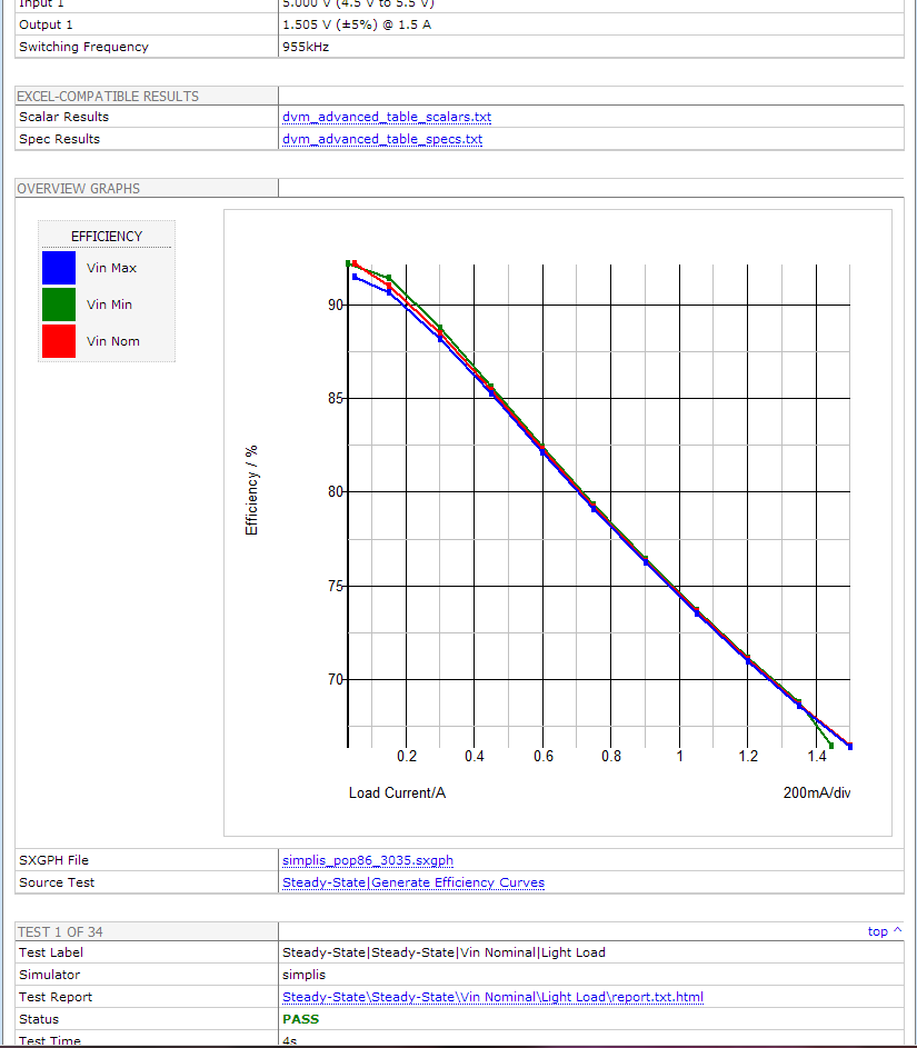
This report differs from the sync-buck report in the following ways:
- First of all, this overview report includes a graph created by the Generate Efficiency Curves test and placed on the overview report with the PromoteGraph() function, as explained in 6.4.2 Promoting Graphs to the Overview Report.
- Secondly, the efficiency curves differ from those in the sync-buck report since these curves are formed from the multi-step data created in the previous test of this testplan. Each point on the efficiency curve represents the efficiency measured during an individual POP simulation run. The actual curves were generated with the CreateXYScalarPlot() function, which is explained in 6.6.2 Using the CreateXYScalarPlot() Function.